Responsive Images: Art Direction in Drupal

The Picture module is Drupal's implementation of the picture element, which is HTML5's solution for responsive images. Coupled with the Breakpoints module, it allows Drupal site builders to assign different image styles to an image, depending upon a device's viewport width and screen pixel density.
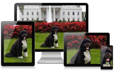
Responsive Image Example
For example, a site's home page contains a hero image that spans 100 percent of the page's width. When I'm viewing the site on a 3840 x 2160 pixel desktop display, I'm going to need a much larger image than when I'm viewing the site on an iPhone 3GS (480 x 320 pixel display). When I'm viewing the site on an iPhone 4s (960 x 640 pixel display), I'm going to need a larger picture than on an iPhone 3GS because while the screen size is an identical 3.5 inches, the iPhone 4s packs in twice the pixels (what Apple calls a "Retina" display). If the site supports four breakpoints at three screen pixel densities, then each image will have twelve versions. Thankfully, once configured, Picture takes care of the heavy lifting. Users upload a single image, and the rest handled for them.
While Picture is a great tool, it's also limited to a single source image. In the hero image from the example above, the loaded image might be 4000x300 pixels for a desktop device but 640x200 pixels for a mobile user. Can the same source image really work for both? Probably not. Enter art direction.
Art Direction
Responsive design allows a website to be device agnostic. Design decisions are made so that the site renders in a usable fashion regardless of the device's viewport. Elements may stack. Padding may increase. A menu bar may be replaced with mobile navigation (e.g. the hamburger icon). Images too are an important part of responsive design, but to this point, art direction for responsive images in Drupal has been half baked at best.
The Responsive Images Working Group, addresses art direction for responsive images:
In a responsive design, it is typical to change an image so it can be targeted towards the features of a particular display (or set of displays). Sometimes this means cropping an image. Other times, it can mean a different image altogether that may have different proportions or may be changed in other ways to communicate more effectively in a layout.
Source: responsiveimages.org
With a single source image and automated image styles, can we truly have art direction in Drupal? With the newly released Image Replace module, the answer is now yes.
Image Replace Module
The Image Replace module "provides a way to supply optional alternative source images mapped to image styles" (source).
In the example above, I may have the following breakpoints:
- max-width: 640px
- max-width: 960px
- max-width: 1920px
- min-width: 1921px
With Image Replace I can use a unique source image at each breakpoint. Each breakpoint would have its own image field on an entity.
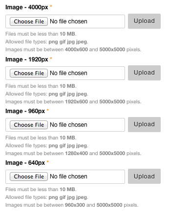
A site editor would simply upload the four source images, and Picture, Breakpoints, and Image Replace will generate the images and the markup.
For step-by-step instructions, see the Use <picture> for art direction use case documentation on Drupal.org.
Comments
znerol (not verified)
Fri, 03/20/2015 - 07:26
Permalink
Thanks for blogging about the
Thanks for blogging about the Image Replace module. I've recently put together a step-by-step guide (https://www.drupal.org/node/2449115) which is a bit easier to follow than the vague directions in the README file.
Chris Burge
Fri, 03/20/2015 - 12:36
Permalink
Updated Link
Thanks for writing the Image Replace module. It fills a key gap in Drupal's responsive image capabilities. I updated the link at the bottom of the article.
Add new comment